[gnso-wpm-dt] Introduction to draft Work Prioritization model
- To: "gnso-wpm-dt@xxxxxxxxx" <gnso-wpm-dt@xxxxxxxxx>
- Subject: [gnso-wpm-dt] Introduction to draft Work Prioritization model
- From: Liz Gasster <liz.gasster@xxxxxxxxx>
- Date: Fri, 20 Nov 2009 12:42:24 -0800
Work Prioritization Team:
As a way to help bring everyone to the same level on the GNSO Work
Prioritization project, I have attempted to consolidate various emails and
organize our latest thinking into a single document. Again, this is a
suggested draft starting place offered by staff and the group is encouraged to
modify it as you feel appropriate. There are three sections as follows:
1) Recommended construct and methodology (see also attached spreadsheet)
2) Draft definitions for two dimensions
3) Procedural questions to be considered
1) Recommended construct and methodology
For this effort, Staff is envisioning a two dimensional matrix or chart (X,Y)
to help the GNSO Council graphically depict its work prioritization. This
concept is based on having each discrete project rated on two dimensions:
Value/Benefit (Y axis) and Difficulty/Cost (X axis). Section 2 below outlines
the preliminary draft definitions for each dimension (or axis), so we will
concentrate in this section on what the chart means, how it would be produced,
and the rating/ranking methodology including sample instructions.
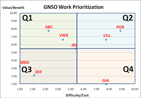
Illustration: The chart below shows 8 illustrative projects (simply labeled
ABC, DEF, GHI, etc.) plotted on two dimensions: Value/Benefit (Y axis) and
Difficulty/Cost (X axis). In this sample depiction, Q1, Q2, Q3, and Q4
represent four quadrants which are drawn at the midpoints of each axis
(arbitrarily set to 10). Thinking about Value/Benefit versus Difficulty/Cost,
Q1 includes those projects that have the highest value and lowest cost;
whereas, Q4 would contain projects with the lowest value and highest cost.
Project ABC, in this example, is ranked 3.25 on Difficulty and 7.75 in Value;
therefore, it is located squarely in Q1. Conversely, project GHI, is rated
7.75 on Difficulty, but only 1.00 on Value and is thereby placed in Q4.
[cid:image001.png@01CA695E.19D8EE90]
How do the projects end up with these individual X, Y coordinates that
determine their placement on the chart?
There are several options for rating/ranking individual projects. We will
look specifically at two alternatives below:
Rating Alternative A:
One option is to ask each Council member, individually and separately, to
rate/rank each project on both dimensions. Even with this alternative (and B
following), there are different methods possible, for example, (1) place a
ranking from 1 to n for each project under each column, or (2) use something a
bit simpler, e.g. High, Medium, and Low to rate each project relative to the
others. Since it is arguably easier to rate each project as H, M, or L versus
ranking them discretely from 1 to n, we will illustrate the former approach
here. Keep in mind that an ordinal ranking methodology would simply
substitute a number (from 1 to 8 in our example) instead of the letters H, M,
or L.
Directions: Rate each project on a scale of HIGH, MEDIUM, or LOW for each
dimension (Value/Benefit, Difficulty/Cost), but keep in mind that the rating
should be relative to the other projects in the set. There are no fixed
anchors for either dimension, so raters are asked to group projects as LOW,
MEDIUM, or HIGH compared to each other. A HIGH ranking on Value simply means
that this project is perceived to provide significantly greater benefit than
projects ranked as MEDIUM.
If there are 20+ raters, we could provide a simple blank matrix and ask them to
provide their individual scorings. For example, assume that the matrix below
is one individual's ratings for all 8 illustrative projects:
PROJECT
VALUE/BENEFIT
DIFFICULTY/COST
ABC
L
H
DEF
L
M
GHI
H
L
JKL
M
M
MNO
L
L
PQR
H
H
STU
M
M
VWX
M
L
Once we have all results submitted (could be simple Word, Excel, or even Text
Email) from all individual raters, Staff would convert each LOW to a Score of
1, MEDIUM = 5.5, and HIGH = 10 (see attached spreadsheet, Rankings tab). We
would then average the rankings for all raters and produce a chart as shown in
the attached spreadsheet (see Summary tab). Note: We only used 4 raters in
the spreadsheet for illustrative purposes, but it is trivial to extend to as
many raters as we decide to involve.
Rating Alternative B:
Instead of asking each Council member to rate/rank each project individually,
the Council could use a grouping technique (sometimes referred to as "DELPHI").
For example, suppose we set up 4 teams based upon existing Stakeholder Group
structures as follows:
Team1: CSG = 6
Team2: NCSG = 6
Team3: RySG (3) + RrSG (3) = 6
Team4: Others (NCA, Liaison) = 4-5
Using this approach, we would have 4 small teams and we would ask for a single
CONSENSUS score sheet from each one (whether ordinally ranked or rated H, M, or
L). Then, we would average those results to produce the overall chart
(similar to the example in the spreadsheet). We should make it clear that we
are discouraging teams from individually rating and averaging their own
results. The benefit, from this modified DELPHI approach, is that individuals
(especially new Council members) can learn from each other and develop,
collectively, what they think the most appropriate answer should be.
The above methodologies are subject to further discussion. Ultimately, the
Council will need to decide:
1) What work prioritization construct should be utilized (we have
suggested a simple two dimensional Risk/Cost vs. Value/Benefit displayed in a
four quadrant model)?
2) How should it be executed, e.g. participation, consensus ranking
(Delphi), individual ratings averaged, etc.?
2) Draft definitions for the X, Y dimensions
Staff proposes the following starting definitions for the axes in this
conceptual model.
X - Difficulty/Cost ... this dimension relates to perceptions of complexity
(e.g. technical), intricacy (e.g. many moving parts to coordinate), lack of
cohesion (e.g. many competing interests), and, therefore, overall cost/time to
develop a recommendation. We could have - but chose not to - create a third
axis to indicate the amount of time required. This adds complexity and we
decided that initially we would include the concept of time into the definition
for level of difficulty.
Y - Value/Benefit ... this dimension relates to perceptions of benefit to ICANN
and its stakeholders in terms of internet growth/expansion, enhancing
competitiveness, increasing security/stability, and improving the user
experience.
Please feel free to word-smith the above descriptions...
3) Procedural questions to be considered
Once the matrix is developed and all projects plotted, what should the Council
do with the results? This is an important question to answer BEFORE the
rating/methodology are finalized and executed.
The Council should discuss and decide questions such as:
1) How often should it be exercised and/or what event triggers an analysis?
2) What decisions or outcomes are expected from the process?
Please let me know if we can provide any additional assistance prior to and
during the upcoming conference call on Monday.
Thanks and regards,
Liz
Attachment:
GNSO Work Prioritization (KBv5).xls
Description: GNSO Work Prioritization (KBv5).xls
- Follow-Ups:
- RE: [gnso-wpm-dt] Introduction to draft Work Prioritization model
- From: Gomes, Chuck
- Re: [gnso-wpm-dt] Introduction to draft Work Prioritization model
- From: Olga Cavalli
- Re: [gnso-wpm-dt] Introduction to draft Work Prioritization model
- From: Stéphane Van Gelder
- Re: [gnso-wpm-dt] Introduction to draft Work Prioritization model
- From: Olga Cavalli
- RE: [gnso-wpm-dt] Introduction to draft Work Prioritization model